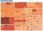
On Jan 15, 2012 the New York Times published an interactive Treemap graphic with the title: “The Top 1 Percent: What Jobs Do They Have?”
It is a good example of the Treemap chart we have covered in previous posts (Treemap of the Market and Implementation of Treemap). From the chart legend:
“Rectangles are sized according to the number of people in the top 1 percent. Color shows the percentage of people within that occupation and industry in the top 1 percent.”
There are approx. 1.4 million households in the top 1 percent; they earn a minimum of about $500k per year, with an average annual income around $1.5m (according to this recent compilation of 10 fun facts about the top 1 percent).
The largest and darkest area in the Treemap are Physicians. Chief Executives and Public Administrators as well as Lawyers are also doing very well, not surprisingly, especially in Security, commodity broker and investment companies. The graphic nicely conveys the general notion that big money is in health, financial and legal services.
One thing to keep in mind is that the chart counts the number of individual workers living in households with an overall income in the top 1 percent nationwide. This skews the picture a bit, since an individual with a low-earning occupation can still live in a top 1 percent household through being married to a top-earning spouse. If you looked at individuals only, the number of top 1 percent earners in occupations such as teacher, receptionist, waiter, etc. would certainly be much smaller.
P.S: I stumbled across this particular chart from Sha Hwang’s “UltraMapping” at PInterest, which is a great collection of maps and other graphics for design inspiration.

