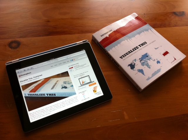
Released just 2 weeks ago I got a copy of “Visualize This”, the new book by FlowingData Blog author Nathan Yau.
You can of course get a lot of details on Nathan’s own website here as well as reviews on Amazon. Below are my first impressions after spending a few hours with this book.
If you have followed Nathan’s blog you will recognize many topics in the book. The book gives a good introduction how to create graphs and visualizations to “tell a story” to the audience. It has comprehensive coverage of topics such as where to get data from, how to get them into the right format and validate them, which tools to use based on what type of aggregation or visualization you intend to create. He focuses specifically on R, a programming language for statistical computing and graphics. He also recommends using a box of tools to leverage the strengths of each of them, such as quickly creating a raw chart in R and then dressing it up in Adobe Illustrator. I’d certainly enjoy using the examples as a tutorial for learning the R language.
The book deserves a lot of credit for being laid out well and using a lot of practical examples from everyday life (aging trends, crime rates, economic charts, unemployment data, company store location & growth, urban population, fertility rates, etc.) which most people can relate to. It’s enjoyable to read and makes its points in fluid, yet precise language.
I already took away a few new ideas about aggregate matrix plots (such as Figure 6-9 Scatterplot matrix of crime rates) or using shapes to compare vectors of multiple variables (such as the star charts and Nightingale Charts in chapter 7). For example, I think the Nightingale chart in Figure 7-18 of crime rates by US state is a very useful visualization showing at a glance both the relative amount as well as the break-down into 6 different types of crime per state.
Don’t expect to learn much in terms of statistics – this book doesn’t purport to go into any sort of statistical depth. It is focused primarily on how to get good visualizations, as compared to incorrect, misleading or even purposely distorting graphs – what Nathan refers to as “Ugly Visualizations” on his Blog.
If I had one wish regarding the contents of this book – or perhaps a sequel some day – I’d say to focus a bit more on interactive graphics. This is obviously hard to do in a printed book, whose pages will always be static. However, there is so much innovation in this area and with the advent of electronic books and media players for interactive content. Together with the advent of mobile computing platforms such as the iPad and book readers such as the Kindle I’m convinced that interactive graphics will enable a whole new way to “tell the story”.


One response to “New book: Visualize This by Nathan Yau”