The previous post on Tube Maps has quickly risen in the view stats into the Top 3 posts. Perhaps it’s due to many people searching Google for images of the original London tube map in the context of the upcoming Olympic Games.
I recently reviewed some of the classes in the free Wolfram’s Data Science course. If you are interested in Data Science, this is excellent material. And if you are using Mathematica, you can download the underlying code and play with the materials.
It just so happens that in the notebook for the Graphs and Networks: Concepts and Applications class there is a graph object for the London subway.
As previously demonstrated in our post on world country neighborhood relationships, Mathematica’s graph objects are fully integrated into the language and there are powerful visualization and analysis functions.
For example, this graph has 353 vertices (stations) and 409 edges (subway connections). This one line of code highlights all stations no more than 5 stations away from the Waterloo station:
HighlightGraph[london,
  NeighborhoodGraph[london, "Waterloo", 5]]
Since HighlightGraph and NeighborhoodGraph are built-in functions, this can be done in one line of code.
Export["london.gif",
  Table[HighlightGraph[london,
    NeighborhoodGraph[london, "King's Cross St. Pancras", k]],
   {k, 0, 20, 1}]]
creates this animated GIF file:
Shortest paths can easily be determined and visualized:
HighlightGraph[london,
  FindShortestPath[london, "Amersham", "Woolwich Arsenal"]]
There are many other graph functions such as:
GraphDiameter[london]   39
GraphRadius[london]     20
GraphCenter[london]     "King's Cross St. Pancras"
GraphPeriphery[london]  {"Watford Junction", "Woodford"}
In other words, the King’s Cross St. Pancras station is at the center, with radius up to 20 out into the periphery, and 39 the shortest path between Watford Junction and Woodford, the longest shortest path in the network.
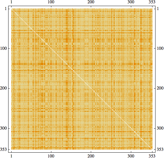
Let’s look at distances within the graph. The built-in function GraphDistanceMatrix calculates all pairwise distances between any two stations:
mat = GraphDistanceMatrix[london]; MatrixPlot[mat]
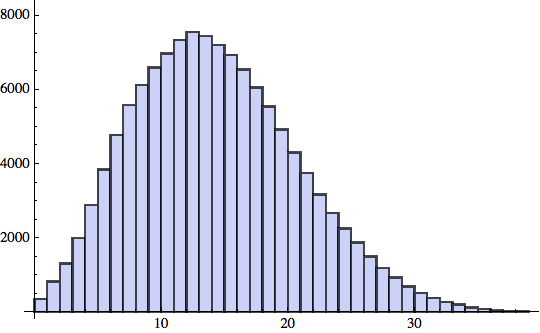
For the 353*353 = 124,609 pairs of stations, let’s plot a histogram of the pairwise distances:
Histogram[Flatten[mat]]
The average distance between two stations in the London subway system is about 14.
So far, very little coding has been required as we have used built-in functions. Of course, the set of functions can be easily extended. One interesting aspect is the notion of centrality or distance of a node from the center of the graph. This is expressed in the built-in function ClosenessCentrality
cc = ClosenessCentrality[london];
HighlightCentrality[g_, cc_] :=
   HighlightGraph[g,
    Table[Style[VertexList[g][[i]],
      ColorData["TemperatureMap"][cc[[i]]/Max[cc]]],
        {i, VertexCount[g]}]];
HighlightCentrality[london, cc]
Another interesting notion is that of BetweennessCentrality, which is a measure indicating how often a particular node lies on the shortest paths between all node-pairs. The following nifty little snippet of code identifies the 10 most traversed stations – along the shortest paths – of the London underground:
HighlightGraph[london,
 First /@ SortBy[
 Thread[VertexList[london] -> BetweennessCentrality[london]],
 Last][[-10 ;;]]]
I have often felt that progress in computer science and in languages comes from raising the level of abstraction. It’s amazing how much analysis and visualization one can do in Mathematica with very little coding due to the large number of powerful, built-in functions. The reference documentation of these functions often has many useful examples (and is also available for free on the web).
When I graduated from college 20 years ago we didn’t have such powerful language platforms. Implementing a good algorithm for finding shortest paths is a good exercise for a college-level computer science course. And even when such pre-built functions exist, it may still be instructive to figure out how to implement such algorithms.
As manager I have always encouraged my software engineers to spend a certain fraction of their time searching for built-in functions or otherwise pre-existing code to speed up project implementation. Bill Gates has been quoted to have said:
“There is only one trick in software: Use a piece of code that has already been written.”
With software engineers, it is well known that productivity often varies not just by small factors, but by orders of magnitude. A handful of talented and motivated engineers with the right tools can outperform staffs of hundreds at large companies. I believe the increasing levels of abstraction and computational power of platforms such as Mathematica further exacerbates this trend and the resulting inequality in productivity.


tube traveller
October 1, 2012 at 9:50 am
the tube map as maths ! Always fun !