Measuring and visualizing inequality is often the starting point for further analysis of underlying causes. Only with such understanding can one systematically influence the degree of inequality or take advantage of it. In previous posts on this Blog we have already looked at some approaches, such as the Lorenz-Curve and Gini-Index or the Whale-Curve for Customer Profitability Analysis. Here I want to provide another visual method and look at various examples.
Inequality is very common in economics. Competitors have different share of and capitalization in a market. Customers have different profitability for a company. Employees have different incomes across the industry. Countries have different GDP in the world economy. Households have different income and wealth in a population.
The Gini Index is an aggregate measure for the degree of inequality of any given distribution. It ranges from 0.0 or perfect equality, i.e. every element contributes the same amount to 1.0 or the most extreme inequality, i.e. one element contributes everything and all other elements contribute nothing. (The previous post referenced above contains links to articles for the definition and calculation of the Gini index.)
There are several ways to visualize inequality, including the Lorenz-Curve. Here we look at one form of pie-charts for some discrete distributions. As a first example, consider the distribution of market capitalization among the Top-20 technology companies (Source: Nasdaq, Date: 9/17/11):
Apple, the largest company by far, is bigger than the bottom 10 combined. The first four (20%) companies – Apple, Microsoft, IBM, Google – are almost half of the entire size and thus almost the size of the other 16 (80%) combined. The pie-chart gives an intuitive sense of the inequality. The Gini Index gives a precise mathematical measure; for this discrete distribution it is 0.47
Another example is a look at the top PC shipments in the U.S. (Source: IDC, Date: Q2’11)
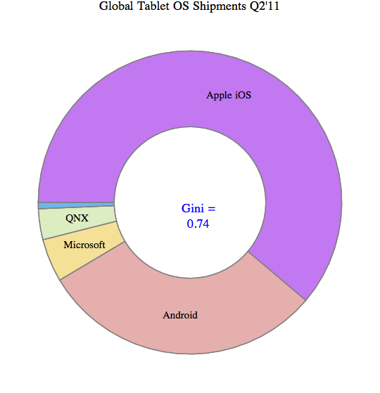
There is a similar degree of inequality (Gini = 0.46). In fact, this degree of inequality (Gini index ~ 0.5) is not unusual for such distributions in mature industries with many established players. However, consider the tablet market, which is dominated by Apple’s iOS (Source: Strategy Analytics, Date: Q2’11)
Apple’s iOS captures 61%, Android 30%, and the other 3 categories combined are under 10%. This is a much stronger degree of inequality with Gini = 0.74
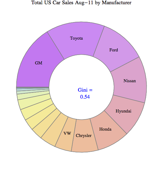
To pick an example from a different industry, here are the top 18 car brands sold in the U.S. (Source: Market Data Center at WSJ.COM; Date: Aug-2011):
When comparing different the Gini index values for these kinds of distributions it is important to realize the impact of the number of elements. More elements in the distribution (say Top-50 instead of Top-20) usually increases the Gini index. This is due to the impact of additional very small players. Suppose for example, instead of the Top-18 you left out the two companies with the smallest sales, namely Saab and Subaru, and plotted only the Top-16. Their combined sales are less than 0.4% of the total, so one wouldn’t expect to miss much. Yet you get a Gini index of 0.49 instead of 0.54. So with discrete distributions and a relatively small number elements one risks comparing apples to oranges when there are different number of elements.
Consider as a last example a comparison of the above with two other distributions from my own personal experience – the list of base salaries of 30 employees reporting to me at one of my previous companies as well as the list of contributions to a recent personal charity fundraising campaign.
What’s interesting is that the salary distribution has by far the lowest amount of inequality. You wouldn’t believe that from the feelings of employees where many believe they are not getting their fair share and others are getting so much more… In fact, the skills and value contributions to the employer are probably far more unequal than the salaries! (Check out Paul Graham’s essays on “Great Hackers” for more on this topic!)
And when it comes to donations, the amount people are willing to give to charitable causes differs immensely. We have seen this already in a previous post on Gini-Index with recent U.S. political donations showing an astounding inequality of Gini index = 0.89. I challenge you to find a distribution across so many elements (thousands) which has greater inequality. If you find one, please comment on this Blog or email me as I’d like to know about it.


Hans-Gerlach Woudboer
September 25, 2011 at 4:45 am
Viewed via Pareto
http://screencast.com/t/rIOq5RlpqV
Hans-Gerlach Woudboer
September 25, 2011 at 4:50 am
or including some cluster details
http://screencast.com/t/NoDs2ooL