
Note: See also the more recent update on the Magic Quadrant for Business Intelligence 2013.
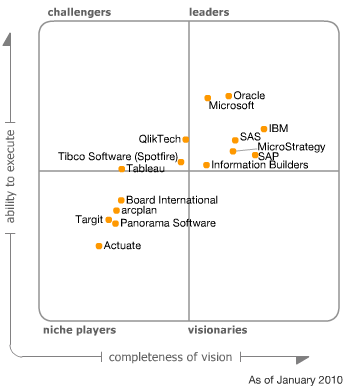
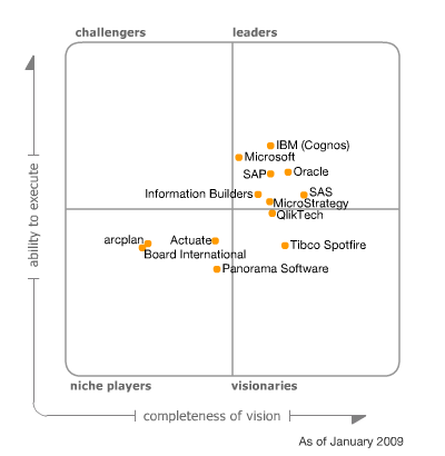
The Gartner group publishes an annual report called Magic Quadrant of Business Intelligence. It compares various vendors in two dimensions: Ability to Execute and Completeness of Vision. These two dimensions span up four quadrants (leaders, challengers, visionaries, niche players).
The key graphic in the Gartner reports is the so called Magic Quadrant diagram. Here is the 2012 version (click the image to see the full report):

Magic Quadrant of BI 2012 (Source: Gartner)
Similar charts have been published for 2011, 2010, 2009, and 2008 (source: Google Image Search).
From these snapshots in time one can create a time-series and compare relative movement of vendors. Here is an interactive version of such a chart created with Tableau Public: (Click on chart below to interact.)

Interactive BI_MagicQuadrant 2008-2012
Disclaimer: There are at least two caveats here: One is the limited quality of the data. The other is the limited applicability of this type of visualization.
Quality: I have contacted two of the authors at Gartner and asked for the (x,y-coord) data of those Magic Quadrants. However, Gartner’s policy is to not disclose these data. Hence I screen-scraped the coordinates off the publicly available images. This brings with it limited accuracy to measure the positions from the images and the possibility of (my) clerical error in entering that data in a spreadsheet.
Applicability: The contacted authors (James Richardson and John Hagerty) both emphasized that due to subtle changes in the way the dimension score is calculated each year such sequential comparisons are not supported by Gartner. In other words, the data may show misleading or unintended conclusions.
Discussion: Of course the original Gartner reports provide a tremendous amount of detail, both around the methodology (which factors contribute to Vision and Execution scores) and on the various vendors, their products and other relevant business aspects like sales channels etc. One also needs to bear in mind that some of these companies emerge or disappear over time.
That said, the interactive time-series chart has many advantages over the individual snapshots:
- You can select a subset of companies (for example all public companies)
- Companies are identified by label and color
- History can be traced for consecutive years
- Trends are more easily detected (see also Disclaimer above)
For example, smaller but rapidly growing companies like Tibco (Spotfire) and Tableau have somewhat vertical trajectories leading them into the “challenger” quadrant with strong increases in the ability to execute. Tibco and QlikTech are the only 2 (of 24) companies to change quadrants in the last 5 years, from visionary to challenger (Tibco) and leader (QlikTech), respectively.

MQ trajectory for Tableau, Tibco, and QlikTech
Some big public companies like IBM, SAP and Microsoft have invested heavily over the last years in the BI space. This has resulted in a more horizontal trajectory within the leader quadrant as they have increased the completeness of their vision, among others through acquisitions of smaller companies (SAP bought Business Objects, IBM bought Cognos).

MQ trajectory for IBM, SAP, and Microsoft
Some individual trajectories are more dynamic than others. For example MicroStrategy has had strong increases first in vision (2008-2009) and then in their ability to execute (2010-2012). By contrast, Actuate has fallen behind relative to others in both execution and vision in the first 3 years, only to stop (2011) and revert (2012) that trend in recent years.

MQ trajectory for Actuate and MicroStrategy
Bottom Line: Data presented via Interactive Charts invites exploration, discovery, and better understanding. Through Tableau Public these charts can easily be shared with others. The Magic Quadrant data is originally curated and presented by Gartner in the traditional snapshot moment-in-time format. IMHO, in this interactive time-series format the data comes to live and yields additional insight. I’d be interested to hear your thoughts and comments on the caveats from the authors about the limited applicability of the time series animation?

5 responses to “Gartner’s Magic Quadrant for Business Intelligence”