RSS

Category Archives: Scientific

Weekly changes in the Coronavirus pandemic

Weekly changes in the Coronavirus pandemic

The global Coronavirus pandemic has caused a series of dramatic changes in markets, economy and policy over just a few weeks.

The known case counts have been tracked and published widely. It is a stunning demonstration of the power of exponential growth.

Mathematical tracking and modeling can help to predict and visualize the near-term and thus inform policy, similar to how meteorology relies on computer model forecasts of weather events.

I’m writing this on Sunday, Mar-15. Let’s look at the data of last few weeks and how the pandemic changed qualitatively. Underlying data comes from this GitHub repository of the Johns Hopkins CSSE.

8 weeks ago (Jan-19)

The Coronavirus outbreak originated in Wuhan, China about 8 weeks ago (mid January). The number of confirmed cases first exceeded 100 new cases on Jan-21. China imposed drastic lock down measures: On Jan-23 Wuhan city and on Jan-24, another 15 cities were shut down, putting 60+M people under lock down. Nevertheless, the number of confirmed cases continued to grow strongly for another 3-4 weeks, from under 1,000 to 70,000+ by Feb-16.

Here is the number of confirmed, active and recovered cases in China over the last 7 weeks.

Confirmed, Recovered and Active Cases in China over last 7 weeks

Active = confirmed – recovered – deaths. Although growing to about 3,000, the number of cases resulting in deaths does not change these graphs qualitatively.

It’s worth noting that the drastic lock-down measures were imposed at the beginning of the above timeline. This shows that even extremely drastic measures have a 3-4 week delay until they produce results in bending the case graph.

For the first 5 weeks (until Feb-23) there were hardly any confirmed cases outside of China.

Let’s look at the qualitative changes over the last 4 weeks.

4 weeks ago (Feb-16)

Two trends start to take shape:

  • The daily increase in new confirmed cases is shrinking dramatically
  • The number of recovered cases is growing exponentially (although at slower rate than the original confirmed cases)

As a result, the number of active cases begins to level off, peaks around 58,100 on Feb-17 and then starts to fall.

This is good news, as it demonstrates that the outbreak can be stopped and reversed. However, by this time it has begun spreading all over the world.

3 weeks ago (Feb-23)

China is still adding new cases, but at a slowing pace. On Feb-23 there are just over 77,000 confirmed cases, only a 10% increase from 1 week earlier. The recovered cases are growing faster than new cases, hence the active cases go down (first time under 50,000 on Feb-24).

Meanwhile, confirmed cases all over the world outside China are taking off, reaching nearly 2,000 by Feb-23. Italy has 155 confirmed cases and records the first 3 deaths.

Rest of world confirmed and active cases

2 weeks ago (Mar-1)

China has the outbreak under control:

  • The confirmed case count is just under 80,000. It will only grow another 1,000 for the next 2 weeks (81,003 as of today Mar-15).
  • There are more recovered cases (42,162) than active cases (34,898).

If China can keep up the lock-down measures, this is fast going in the right direction.

Outside of China the situation escalates quickly. By Mar-2, the confirmed case count for

  • World (without China) exceeds 10,000
  • Italy exceeds 2,000

The case counts in Italy show no signs of slowing down. The increase for the first time is greater than 300 new cases per day. In fact, today (2 weeks later) the increase has exploded 12-fold to 3,590 new cases in one day!

1 week ago (Mar-8)

For the first time, there are more active cases outside of than in China. Active cases on Mar-8:

  • World (without China): 24964
  • China: 20335

Moreover, China’s active case count continues to fall, while the world’s active cases grow exponentially.

Total confirmed cases in China and rest of world

There are very few countries (South Korea) which appear to be able to follow China’s path of controlling an epidemic in their country once it exceeds hundreds of cases.

South Korea’s increases are beginning to slow down, and Italy (7,375) surpasses South Korea (7,314) to rank highest in confirmed cases outside China.

Most other countries in the Top 10 confirmed cases at this point are seeing exponential growth with no sign of slowing down. What’s worse, they are only now beginning to implement lock-down measures. The WHO declares the coronavirus outbreak a global pandemic on Mar-11. That same day, Italy shuts down and closes all commercial activities, offices, cafes, shops. Only transportation, pharmacies, groceries will remain open. As we have seen, even if these measures were to be equally successful as in China, it would still take at least 2-3 weeks (i.e. end of March) before the active case load would flatten and peak out.

Today (Mar-15)

Today marks the first day with more confirmed cases outside (85,308) than in China (81,003). While 4 weeks ago China had 99% of all cases, it now has less than 50% of worldwide cases.

Just two days ago (Mar-13), Italy became the country with the most active cases (14,955), ahead of China in second place (13,569).

In this coming week, thanks to its continuing fall of active cases, China’s rank in active case count will drop behind several other countries like Iran, Spain, Germany, France, and the USA.

Active case in China and rest of world

What used to be a China problem is now a world problem. China has it under control. Most other countries are out of control.

Italy vs. USA

Confirmed Cases in Italy, USA and California

Source: Twitter, @sonyaharris_

This shows how similar the initial phase of exponential increase is, with different countries or states behind by a fixed number of days. (Here USA is 11 days behind Italy, CA is 7 days behind the entire US.) Without any drastic differences in interventions and with similar levels of testing, this table easily predicts the approximate number of confirmed cases. For example, the US will have 20,000+ confirmed cases by around Mar-25, with CA alone exceeding 20,000 cases by Apr-1.

Addendum

Summary of qualitative changes by timeline:

  • Jan-23: 600 confirmed cases, with 400 new on that day; Wuhan city shuts down
  • Feb-17: China active cases peak at 58,108 (3.5 weeks after shutdown).
  • Mar-1: China confirmed cases level off at 80,000. Over next 2 weeks, adds only ~1,000 more. More recovered cases (42,162) than active cases (34,898).
  • Mar-2: Rest of world > 10,000 and Italy > 2,000 confirmed cases.
  • Mar-8: More active cases (24,964) in rest of world than in China (20,335).
  • Mar-13: Italy has most active cases (14,955), ahead of China (13,569).
  • Mar-15: More confirmed cases (85,308) in rest of world than in China (81,003).
  • Last 4 weeks, China added ~10,500 confirmed cases.
    Rest of world added ~10,200 just yesterday!

Model Estimates (Source: Medium article with Wuhan timeline analysis):

  • Number of actual infections about 25x that of confirmed cases
  • 3-4 week delay between lock-down measures and peak of active cases
    (more with less aggressive lock-down)
  • Peak active cases about 100x (~60,000) the confirmed cases at lock-down (600)
  • Final confirmed cases level off at about 100-150x the number on day of lockdown
  • Early on, the number of actual infections is about 800x the number of reported deaths.
  • A single day of delaying drastic measures can increase confirmed cases by ~40%


(Optimistic) Predictions for the US as of 3/15:

  • Case counts: 3,806 confirmed, 3,664 active, 69 deaths, 73 recovered.
  • Estimated 55,200 (800x deaths) – 95,150 (25x confirmed) actual cases;
    we have between 50-100k actual cases and no severe lockdown measures in place yet!
  • Even if we locked down now (3/16) as severely as in Wuhan:
    • We would still expect another 3-4 weeks of active case growth with peak at ~360,000
    • We would expect a total of ~500,000 confirmed cases by ~ Apr-8
    • If we wait just one more day (3/17), make that ~700,000 cases (40% or 200,000 more)
      If we wait two more days (3/18), the total doubles to ~1,000,000 cases
  • Assuming 1% fatality, this puts us at 5,000-10,000 deaths.

I’m no medical expert, but all I’m reading recently points to the actual numbers trending far worse than the above optimistic scenario predictions. Even the CDC has floated predictions of final US deaths ranging from 500,000 – 1.7 million in the next 12-18 months. A million people in the US could die from this!! Not sure why anyone would still brush this aside as no big deal. Statements made reflecting such attitude will not age well.


Addendum 3/17

The case numbers in this pandemic change very rapidly, as do the respective rankings. Here are some more observations and predictions for the United States:

Observations:

  • Cases ~200,000 confirmed, 8,000 deaths, 83,000 recovered and 109,000 active

Ranks:

  • Confirmed cases: China, Italy, Iran, Spain, Germany; US (8th)
  • Active cases: Italy, Spain, Iran, Germany, China ; US (8th)
  • New cases: Italy, Germany, Spain, US (4th), Iran
  • Deaths: China, Italy, Iran, Spain, France, US (5th)
  • New Deaths: Italy, Spain, Iran, France, US (5th)

Relative Growth:

  • US used to be 11 days behind Italy’s total numbers, now (3/17) only 10 days behind, gap closing (see factors below)

Active cases for Italy and the US (actuals and exponential trendlines)


Predictions for the US:

Case counts:

  • Estimated Confirmed 28,000 by 3/22 ; 221,000 by 3/29 (from best-fit exponential trendline of last 14 days)


Ranks:

  • Tomorrow (3/18) the US will have more active cases than China!
    (China will be 7th behind France and the USA)
  • By next Sunday (3/22) US will be top ranked in new cases.
  • By end of March the US will be top ranked in active cases.


Contributing factors:

  • Population longer in denial, partly due to politicized atmosphere
  • Lock-down measures later in case growth and less drastic (each state individually)
  • US nearly the size of all EU, about 4x Germany or 5x Italy
  • US late in testing; today (3/17) not even all hospital cases get tests (delays actual numbers)
  • When tests become more widely available, numbers will grow at faster rate than model forecast
  • Italy ahead by 10 days, but last 4 days near linear growth (i.e. at inflection point) and
    recovered (and 1-6% death) cases will reduce active case count


This pandemic used to be a China story until early March. Now in mid March this is a European story. By end of March this will be a US story.

 
Leave a comment

Posted by on March 15, 2020 in Medical, Scientific


Visualizing Voting Preferences for World Values

The other day I listened to a presentation by Melinda Gates prepared for the United Nations to deliver an update about progress towards the Millennium Development Goals (MDG). The eight goals of the MDG had been embraced by the UN back in 2005 for the time target of 2015. So it is reasonable to see whether the world is on track to reach each of these eight goals. To summarize, from the MDG Wikipedia page:

  1. Eradicating extreme poverty and hunger
  2. Achieving universal primary education
  3. Promoting gender equality and empowering women
  4. Reducing child mortality rates
  5. Improving maternal health
  6. Combating HIV/AIDS, malaria, and other diseases
  7. Ensuring environmental sustainability
  8. Developing a global partnership for development

A good listing of reports, statistics and updates can be found on the UN website here.

Sample Vote for 6 of 16 MDG choices

Sample Vote for 6 of 16 MDG choices

At the end of Melinda’s presentation is a link to a UN global survey on the MDG goals after 2015. I took this survey and found the visualization of voting results quite interesting. First, one is asked to select six out of a list of sixteen (6 of 16) goals which one thinks have the highest impact for a future better world. (The survey methodology is described in more detail here.) Here is a sample vote:

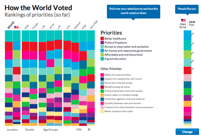
A nice touch is that for each of the sixteen goals there is a different color and when you check that goal, one of the sixteen areas on the stylized globe is filled with that color. Personal data such as name is optional, but some demographic information is required, including age, gender, educational level and country. Next, one can look at a summary of all currently tallied votes and compare them interactively to ones own vote (checkmarks on the right).

WorldVoteOverview

It is perhaps not surprising that I voted very similar to others in similar demographic cohorts.

  • Country: I picked five of the Top five goals like all other voters living in the US. I included ‘Political freedoms’ in my top six, which in the US only ranks 11th.
  • Age: I shared five of the Top six goals with people in my age group (world-wide). The one I did not check was ranked 4th (Better job opportunities). When you mouse over one of the goals, the display changes to highlight this goal in all columns:
Interactive Vote Analysis with highlighted goal

Interactive Vote Analysis with highlighted goal

  • Gender: Here I picked four of the Top five goals (did not include the ‘Better job opportunities’).
  • Education: I voted very similar to people with very high HDI (Human Development Index, a visualization of which we covered in a previous post) with five of the Top six.

From the above, it seems somewhat surprising that voters in the US did not ascribe a higher value to ‘Better job opportunities’, given how much economic values and topics like unemployment seem to dominate the media. That said, these votes should be a reflection about which goals are most valuable for making the world a better place – not just your own home country. Worldwide it seems that other, more fundamental goals are judged by voters in the US to be more important than ‘Better Job opportunities’.

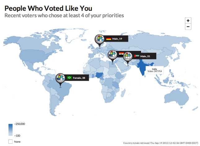
Another chart on the results page is showing a heat map of the world countries based on how many votes have been submitted. I thought it was interesting that Ghana had submitted about twice as many votes as all of the US, and Nigeria about 7x as many. The country with most voters at this time is India, but not far ahead of Nigeria.

CountryTotals

A fairly useless dynamic animation in this map is a map pin drop of four people who voted similarly to me. I found this too anecdotal to be of any real interest and downright annoying that I couldn’t turn it off. and just focus on the vote heat map. For example, the total number of votes should be displayed in the Legend. I vaguely remember that it was several hundred thousand from 194 countries prior to starting the survey, but couldn’t get that data to display again without clicking on the Vote Again:

MyWorldVotes

 
Leave a comment

Posted by on September 21, 2013 in Education, Medical, Scientific


Circos Data Visualization How-to Book

Earlier this year we have looked at a powerful data visualization tool called Circos developed by Martin Krzywinski from the British Columbia Genome Science Center. The previous post looked at an example of how this tool can be used to show complex connectivity pathways in the human neocortex, so-called Connectograms.

Circos Book Cover

The Circos tool can be used interactively on the above website. In that mode you upload jobs via tabular data- and configuration-files and have some limited control over the rendering of the resulting charts. For full expressive power and flexibility, Circos can also be downloaded freely and used on your computer for rendering with extensive customization control over the resulting charts.

I have been asked to review a new book titled “Circos Data Visualization How-to“, published by Packt Publishing here. It’s main goal is to guide through the above download + installation process and get you started with Circos charts and their modification. Here is a brief review of this book.

Although originally developed for visualizing genomic data, Circos has been applied to many other complex data visualization projects, incl. social sciences. One such study was done by Tom Schenk, who analyzed the relationships between college majors and the professions those graduates ended up in. It appears as if this work inspired the author to write this book to help others with using Circos.

I downloaded the book in Kindle format and read it on the Mac due to the color graphics and the much larger screen size. It’s well structured and around 70 pages in printed form. The book focuses first on the download and install part, then has a series of examples from first chart to more complex ones using customization such as colors, ribbons, heat maps or dynamic binding.

Flow Chart for creation of Circos charts

Flow Chart for creation of Circos charts

Circos is essentially a set of Perl modules combined with the GD graphics library.

The first part is on Installing Circos, with a chapter each on Windows 7 and on Linux or Mac OS. Working on MAC I went the latter route. I ended up right in the weeds and it took me about 4 hours to get everything installed and working. The description is derived from a Linux install and is generally somewhat terse. It assumes you have all prerequisite tools installed on your Mac or at least that you are savvy enough to figure out what’s missing and where to get it. I had to dust off some of my Unix skills and go hunting for solutions via Google to a list of install problems:

  • directory permissions (I needed to warp the exact instructions with sudo)
  • installing Xcode tools from Apple for my platform (make was not preinstalled)
  • understanding cause of error messages (Google searches, Google group on Circos)
  • locating and installing the GD graphics library (helpful installing-circos-on-os-x tips by Paulo Nuin)
  • version and location issues (many libraries are in ongoing development; some sources have moved)

Others may find this part a lot easier, but I would say there should be an extra chapter for the Mac with tips and explanations to some of these speed bumps. On the plus side, the Google group seems to be very active and I found frequent and recent answers by Circos author Martin Krzywinski.

The next part of the book is easy to understand. One creates a simple hair-to-eye color relationship diagram. Then configuration files are introduced to customize colors and chart appearance. All required data and configuration files are also contained in the companion download from the Packt Publishing book page.

Chart of relationship between hair and eye colors

Chart of relationship between hair and eye colors

The last part of the book goes into more advanced topics such as customizing labels, links and ribbons, formatting links with rules, reducing links through bundling, and adding data tracks as heat maps or histograms. This is the meat for those who intend to use Circos in more advanced ways. I did not spend a lot of time here, but found the examples to be useful.

Contributions by State and Political party during 2012 U.S. Presidential Elections

Contributions by State and Political party during 2012 U.S. Presidential Elections

This section ends abruptly. One gets the feel that there are other subtleties that could be explored and explained. A summary or outlook chapter would have been nice to wrap up the book and give perspective. For example, I would have liked to hear from the author how much time he spent with various features during the college major to professions project.

In summary: This book will get you going with Circos on your own machine. Installing can be a challenge on Mac, depending on how familiar you are with Unix and the open source tool stack. The examples for your first Circos charts are easy to follow and explain data and configuration files. The more advanced features are briefly touched upon, but require more experimentation and time to understand and appreciate.
Circos author Martin Krzywinski writes on his website: “To get your feet wet and hands dirty, download Circos and a read the tutorials, or dive into a full course on Circos.” The How-to book by Tom Schenk helps with this process, but you still need to come prepared. If you are a Unix power user this should feel familiar. If you are a Mac user who rarely ever opens a Terminal then you might be better off just using Circos via the tableviewer web interface.
Lastly, I would recommend buying the electronic version of this book, as you can cut & paste the code, leverage the companion code and documents. A printed version of this book would be of very limited use.

 
1 Comment

Posted by on December 6, 2012 in Education, Scientific


Tags: , , ,

Superstorm Sandy – Visualizing Hurricanes

Superstorm Sandy – Visualizing Hurricanes

Time-lapse animation of Sandy Oct-28 from geostationary orbit, 1 frame per minute, 11 hours of daylight. Although “only” a category 1 hurricane, this superstorm has enormous size. Tropical storm force winds extend out over an area 900 miles in diameter.

Living in South Florida makes you alert to tropical storms during hurricane season from May to November. Exactly 7 years ago, at the end of October 2005, the eye of category 3 hurricane Wilma swept over our home in West Palm Beach in South Florida – the most powerful natural weather event I have ever witnessed. After avoiding a direct hit since then, we got a massive rain event from Isaac earlier this year, but again avoided a direct hit. To be sure, often the flooding associated with hurricanes is worse than the wind damage. For example, when hurricane Katrina hit New Orleans in August 2005, most of the devastation came from flooding after the levees were breached. But the first question is always where the storms will make landfall and how strong they are when they hit your area.

Tropical storms are being tracked and forecast in great detail, in particular by the National Hurricane Center of the National Weather Service. There are many great visualizations illustrating the path, windspeed, rainfall, extent of tropical storm force winds, etc. Due to the convenience for browsing, I have almost completely switched to following hurricane or weather updates from the iPad. (In this case I’m using the Hurr Tracker app from EZ Apps.)

Last week a new tropical storm emerged in the Carribean and was named ‘Sandy’. A few days ago with Sandy’s center over the Bahamas, the path looked like this:

Path of hurricane Sandy as of Oct-25 (Hurr Tracker iPad app)

Note the use of color for wind speed and the cone of uncertainty in the lower segment, as well as the rings around the center indicating the size of the area with storm-force winds.

Naturally curious whether South Florida was likely to get hit, another image gave us some relief:

5 Day tracking map for hurricane Sandy

Now a few days later, while we did get some strong northerly winds and pounding surf leading to beach erosion, Sandy was not a particularly disturbing event for South Florida. At the same time, however, Sandy is forecast to make landfall on the Jersey shore within about 24 hours during the night from Monday to Tuesday.

One interesting set of maps with a color code displaying the probability of an area experiencing winds of a certain speed, say at least tropical storm force winds (>= 39 mph). The following map was issued this afternoon and indicates the very large area (mostly offshore) with near 100% probability of exceeding tropical storm force winds in purple.

Tropical storm force wind speed probabilities for hurricane Sandy as of Oct-28

This indicates how large Sandy is – an area the size of Texas with tropical storm force winds! Meteorologists are concerned for the Northeast due to Sandy converging with two other weather events, a storm from the West and cold air coming down from the North. This is expected to intensify the weather system, similar to the Perfect Storm of 1991. Due to the timing around Halloween this is why Sandy was also called a ‘Frankenstorm’.

One of the most chilling pictures is this animated GIF from WeatherBELL. A story in the Atlantic earlier today writes this:

Dr. Ryan Maue, a meteorologist at WeatherBELL, put out this animated GIF of the storm’s approach yesterday. “This is unprecedented –absolutely stunning upper-level configuration pinwheeling #Sandy on-shore like ping-pong ball,” he tweeted. It shows how cold air to the north and west of the storm spin Sandy into the mid-atlantic coastline.

(Click the image if the animation doesn’t play in your browser.)

Animation of hurricane Sandy moving into the NorthEast (Source: WeatherBELL)

Understandably this forecast of superstorm Sandy has the authorities worried. The full moon tomorrow exacerbates the tides and New York City is expecting up to 11 ft storm surge. Cities across the Northeast are taking precautions as of this writing. For example, the New York City subway metro transit system is shutting down tonight and several hundred thousand people in low-lying coastal areas are under mandatory evacuation order. More than 5000 flights to the area on Monday have been cancelled. Take a look at the expected 5 day precipitation forecast in the Northeast. Some areas may get up to 10 inches of rain and/or snow!

5 day precipitation forecast with Sandy’s impact for the Northeast

The first priority is to use such visualizations to communicate the weather impact and allow people to take necessary precautions. One can use similar hurricane charts to visualize other uncertain events, such as the future outcomes of development projects. We will look at this in an upcoming post on this Blog.


Addendum 11/4/12: The NYTimes has provided some interactive graphics detailing the location and size of power outages caused by superstorm Sandy in the New York and New Jersey area. The New York City outages have been summarized in this chart, normalized to the percentage of all customers. As can be seen, the efforts to restore power over the first 6 days have been fairly successful, especially in Manhattan and Staten Island, less so in Westchester.

6 day tracking map of power outages caused by Sandy in New York City

 
Leave a comment

Posted by on October 28, 2012 in Recreational, Scientific


Tags: , ,

Keystroke Biometrics using Mathematica

Keystroke Biometrics using Mathematica

A few weeks ago Paul-Jean Letourneau posted an article on Wolfram’s Blog about using Mathematica to collect and analyze keystroke metrics as a way to identify individuals. The article analyzes how you type, measuring the time intervals between your typing the individual characters using a little interactive widget, collecting and visualizing the data while you repeatedly type in the word “wolfram”.

Keystroke metrics of 50 trials typing the word “wolfram”


It is somewhat interesting at this point to analyze one’s one typing style. For example there appears to be a bi-modal distribution of the time intervals between keystrokes, with the sequence “r-a” taking me almost twice as long (~130ms) as most other sequences (~60-70ms). There is also a ‘learning’ effect visible in my 50 trials, where the speed improves noticeably after about 20 repetitions or so. However, there are occasional relapses into a much slower typing pattern throughout the rest of the trials.

However, what I thought was more interesting is the subsequent analysis the author did across a set of 42 such series he obtained from his colleagues (noting humorously that “it just so happens that Wolfram is a company full of data nerds”). He then proceeds to analyze and visualize that data in various ways.

Distribution Histogram of keystroke intervals

He observes the bimodal nature of the distribution with peaks around 75ms and 150ms for different pairs of characters. In fact, averaging over all those pair typing times, a correlation is found indicating that when people type slower they are more consistent.

(Negative) Correlation of pairwise typing speed and consistency

The analysis continues with the observation that each measurement can be seen as a point in a six-dimensional space (six pair-transitions in a word with seven characters). When a person types this same word 50 times you get a cluster of 50 points in six-dimensional space. Different individuals will produce different clusters. So one can use the (built-in) function FindClusters to determine such clusters. However, since people have a certain amount of inconsistency in their typing, it is possible that sometimes one person’s typing will show up in another person’s cluster and vice versa. To measure the quality of the clusters to distinguish individuals, one can implement various measures. The author implements the Rand-index, a measure of the similarity between two data-clusterings. This gives a numeric accuracy on a scale from 0 to 1 for the ability to distinguish between a pair of two people. When looking across all pairs of 42 people – there are 21*41=861 different pairs, but the author chose to look at all 42*42=1764 pairs, as the FindCluster results depend on the sequence input data, so Rand[i,j] may be different from Rand[j,i] – you get the following histogram of Rand quality scores:

Histogram of Rand quality score for all pairs

This clearly shows that keystroke metrics for one word are not sufficient to reliably distinguish between arbitrary pairs of people. The average quality score is only 0.67. On the other hand, about 400 (~23%) of those quality scores are a perfect 1.0, so for about a quarter of the pairs it alone would suffice to reliably distinguish the two people typing. About half as many scores are 0.0, meaning that the clusters overlap so much that no distinction is possible. The remaining scores are distributed mostly between 0.5 and 1.0, meaning you would just guess right more often than wrong.

The author wraps up the post with this paragraph:

Using this fun little typing interface, I feel like I actually learned something about the way my colleagues and I type. The time to type two letters with the same finger on the same hand takes twice as long as with different fingers. The faster you type, the more your typing speed will fluctuate. The more your typing speed fluctuates, the harder it will be to distinguish you from another person based on your typing style. Of course we’ve really just scratched the surface of what’s possible and what would actually be necessary in order to build a keystroke-based authentication system. But we’ve uncovered some trends in typing behavior that would help in building such a system.

An interactive CDF widget embedded in the article allows you to collect and visualize the timing of your own typing. Source code as well as the test data is also shared if you want to further explore the details of this interesting analysis.

 
1 Comment

Posted by on July 20, 2012 in Linguistic, Scientific


Tags: , , , , , ,

Visualign Blog – View Stats for first year and a half

Visualign Blog – View Stats for first year and a half

I started this Data Visualization Blog back at the end of May 2011. WordPress provides decent analytics to measure things like views, referrer, clicks, etc. The built-in stats show bar charts by day/week/month, views by country, top posts and pages, search engine terms, comments, followers, tags and so on. I have accumulated the view data and wanted to share some analysis thereof.

At this point there are 17,000 views and 56 posts (about 1 post per week). The weekly views have grown as follows:

Weekly Views of Visualign Blog

The WordPress dashboard for monthly views looks like this:

Assuming an exponential growth process this amounts to a doubling roughly every 3 months. This may not sound like much, but if it were to continue, it would lead to a 16x increase per year or a 4096x increase in 3 years. Throughout the first year this model has been fairly accurate and allowed to predict when certain milestones would be reached (such as 10k views, reached in Apr-2011 or 100k views, predicted by Jan-2013).

However, the underlying process is not a simple exponential growth process. Instead it is the result of multiple forces, some increasing, some decreasing, such as level of interest of fresh content for target audience, rather short half-life of web content, size of audience, frequency of emails or tweets with links to the content etc. So I expect growth to slow down and consequently the 100k views milestone to be pushed out past Jan-2013.

Views come from some 112 countries, albeit very unevenly distributed.

Views by Country (10244 views since Feb-25, 2012)

The Top 2 countries (United States and United Kingdom) contribute nearly half of the views, the Top 10 (9%) countries nearly 75% of all views. The fairly high Gini index of this distribution (~0.83) indicates strong dependency on just a few countries. The only surprise for me in the Top 10 list was South Korea, ranking fifth and slightly ahead of India. Germany is probably a bit over-represented due to my German business partner (RapidBusinessModeling) and related network.

Views by country with Top 10 list

One interesting analysis comes from looking at the distribution of views over weekdays. Not every weekday is the same. Thursdays are the busiest, Saturday the quietest days. After a little more than one year, averaging over some 56 weeks, the distribution looks like this.

Weekday variation of Blog views averaged over 1st year

Of course, time zone boundaries may cause some distortions here, but it looks like the view activity builds during the week until it hits a peak on Thursday. Then it falls sharply to a low on Saturday, and builds from there again. This fits with intuition: One would expect the weekend days to be low as well as Monday and Friday to be lower than the mid-week days. It’s tempting to correlate that with the amount of work or research getting done by professionals. The underlying assumption is that people discover or revisit my Blog when it fits into their work.

A large fraction (> 65%) of referrals comes from search engines. Within those, it’s mostly Google (>90% summed across many countries) with just a small amount of others like Bing. It’s safe to say that without Google search my Blog would have practically no views. Chances are that your first exposure to this Blog came from a Google search as well. One unexpected insight for me was to see a high ratio of image to text searches, typically 3:1 or 4:1. In some ways it shouldn’t be surprising that a blog on data visualizations gets discovered more often by searching for visual elements than for text. It also jibes with the enormous growth of image related sites such as Instagram or Pinterest. I just would not have expected the ratio to be that high.

The beginning is always slow. But any exponential growth sooner or later leads to rather large numbers. So the real question is how one can keep the exponential growth process going? I’d love to hear your comments. If you want to compare this against your own Blog stats, I have shared the underlying data as a Google doc here. I have no idea how this compares to other blog stats in similar domains. If you know of any other public Blog stats analysis, please comment with a pointer below. Thanks.

Addendum 7/11/2012: Today my Blog reached 20,000 views. I noticed over the last few weeks that the deviation from an exponential growth model was getting quite large. For an exponential trend line R² = 0.9886.

Daily views with 20,000 total view milestone

When instead modeling the weekly views on a linear growth rate, this gives the total views a quadratic growth. Curve fitting the total views with a 2nd order polynomial yields a very good fit (R² = 0.9977).

Total views growth curve with quadratic curve fit

Linear growth of weekly views is compatible with approximately linear increase in content (steady frequency of about 1 post / week) and thus increased chance of Google search indexing new content (with Google search the main source of view traffic). Quadratic growth of total views is also nonlinear, but far slower than exponential growth. For example, the 100,000 view milestone is now projected to be reached in 08/2013 instead of in 01/2013, i.e. in 13 months as compared to 7 months.

Addendum 11/1/2012: The Blog reached 30000 views on Oct-19 and here is a chart of the monthly views through Oct-2012:

Monthly Blog views through Oct-2012

August and September have been slow, presumably seasonal variation. I also didn’t post between late August and mid October. The view data of the last couple of months no longer support the theory of significant growth in view frequency. Instead, multiple dynamic factors come into play. At times views spike due to a mention or a post of temporary interest – such as the recent post on visualizing superstorm Sandy. But such spikes quickly fade away according to the very limited half-life of web information these days. The undulating 4 week trailing average in weekly views below visualizes this clearly. The net effect has been a plateau in view frequency around 3000 per month.

Weekly Views with average Nov 2012

I continue to see most of the referrals coming from Google searches, still with a majority of those being image searches. Engagement growth has been anemic, with relatively few comments, back links or other forms of engagement. It seems to me that growth proceeds in phases, with growth spurts interspersed by plateaus of varying length. One such growth spurt has been reported by Andrei Pandre on his Data Visualization Blog through the use of Google+. Perhaps it’s time to extend this Blog to Google+ as well.

Variation of views by weekday

With regard to variation of views by weekday, the qualitative pattern remains. Tuesday is now emerging as the day with the most views, with Monday, Wednesday, and Thursday slightly behind, but still above average. Friday is slightly below average, Saturday is the lowest day with only half the views and Sunday in between.

I’m not sure whether to conclude from that that important posts should be published on a particular weekday. Again, most views come from Google searches and are accumulated over time, so perhaps only the height of the initial spike will vary somewhat based on the publishing weekday.

 
Leave a comment

Posted by on June 12, 2012 in Scientific


Venn Diagrams

Venn Diagrams

The private library Blog had a post with some word play relating to sound, spelling and meaning of words in the English language. From their post on Homographic Homophones:

English is one of the most difficult languages in the world for a non-native speaker to learn.  One of the reasons why this is so is that English has a large number of words that are pronounced the same as other words (i.e., they are homophones) even though they have quite different meanings.  Homophones such as parepair and pear, for example, have the same pronunciation but are spelled differently and have different meanings (heterographic homophones).  Other homophones — tender (locomotive),tender (feeling) and tender (resignation), for instance — are spelled the same and pronounced the same (homographic homophones) but have different meanings (i.e., they are homonyms).

Got all that?  Wikipedia has a nice Venn diagram that may help you sort it out:

Venn Diagram displaying meaning, spelling, and pronunciation of words (Source: Wikipedia)

Of course, you could also list the above combinations in a table. If you’re interested, Carol Moore has done just that on her Buzzy Bee riddle page.

A beautifully symmetric 5 set Venn diagram drawn from ellipses has been proposed by Branko Grünbaum and drawn by Wikipedia contributor Cmglee:

Symmetrical_5-set_Venn_diagram (Source: Wikipedia)

Such set-based diagrams invite a more mathematical notation. Cmglee annotates his image with this snippet:

Labels have been simplified for greater readability; for example, A denotes A ∩ Bc ∩ Cc ∩ Dc ∩ Ec (or A ∩ ~B ∩ ~C ∩ ~D ∩ ~E), while BCE denotes Ac ∩ B ∩ C ∩ Dc ∩ E (or ~A ∩ B ∩ C ∩ ~D ∩ E).

If you search the Wolfram Demonstration Project for ‘Venn Diagram’, you get several interactive diagrams.

Venn Diagram Demonstration Projects (Source: Wolfram Demonstration Project)

These diagrams are interactive. For example, they allow you to click on any subset and then have that set highlighted and the corresponding mathematical set notation displayed accordingly. Interesting and fun to learn.

Speaking of fun: Venn diagrams are also effectively used in many different areas, two of which I’d like to leave you with here:

Data Science Venn Diagram (Source: drewconway.com)

And last but not least, Stephen Wildish’s Pancake Venn Diagram:

 
Leave a comment

Posted by on June 10, 2012 in Linguistic, Scientific


Tags: , , ,

Connectograms and Circos Visualization Tool

Connectograms and Circos Visualization Tool

Yesterday (May 16) the Public Library of Science (PLoS) published a fascinating article titled “Mapping Connectivity Damage in the Case of Phineas Gage“. It analyzes the brain damage which the famous trauma victim sustained after an accident drove a steel rod through his skull. Railroad worker Phineas Gage survived the accident and continued to live for another 12 years, albeit with significant behavioral changes and anomalies. Those changes were severe enough for him to have to discontinue his work and also get estranged from his friends who stated he was “no longer Gage”. This has become a much studied case about the impact of brain damage on behavior anomalies. Since the accident happened more than 150 years ago there are no autopsy data or brain scans from Phineas Gage’s brain. So how did the scientists reconstruct the likely damage?

Since a few years there has been interest in the human connectome. Just like the genome is a map of human genes, the connectome is a map of the connectivity in the human brain. The human brain is enormously complex. Most estimates put the number of neurons in the hundreds of billions and the synaptic interconnections in the hundreds of trillions! Using diffusion weighted (DWI) and magnetic resonance imaging (MRI) one can identify detailed neuron connectivity. This is such a challenging endeavor that it drives the development of many new technologies, including the data visualization. The image resolution and post-processing power of modern instruments is now large enough to create detailed connectomes that show major pathways of neuronal fibers within the human brain.

The authors of the Laboratory of Neuro Imaging (LONI) in the Neurology Department at UCLA have studied the connectomes of a population of N=110 healthy young males (similar in age and dexterity to Phineas Gage at the time of his accident). From this they constructed a typical healthy connectome and visualized it as follows:

Circular representation of cortical anatomy of normal males (Source: PLoS ONE)

Details of the graphic are explained in the PLoS article. The outermost ring shows the various brain regions by lobe (fr – frontal, ins – insula etc.). The left (right) half of the connectogram figure represents the left (right) hemisphere of the brain and the brain stem is at the bottom, 6 o’clock position of the graph.

Connectograms are circular representations introduced by LONI researchers in their NeuroImage article “Circular representation of human cortical networks for subject and population-level connectomic visualization“:

This article introduces an innovative framework for the depiction of human connectomics by employing a circular visualization method which is highly suitable to the exploration of central nervous system architecture. This type of representation, which we name a ‘connectogram’, has the capability of classifying neuroconnectivity relationships intuitively and elegantly.

Back to Phineas Gage: His skull has been preserved and is on display at a museum. Through sophisticated spatial and neurobiological reasoning the researchers reconstructed the pathway of the steel rod and thus the damaging effects on white matter structure.

Phineas Gage Skull with reconstructed steel rod pathway and damage (Source: PLoS ONE)

Based upon this geospatial model of the damaged brain overlaid against the typical brain connectogram from the healthy population they created another connectogram indicating the connections between brain regions lost or damaged in the accident.

Mean connectivity affected in Phineas Gage by the accident damage (Source: PLoS ONE)

From the article:

The lines in this connectogram graphic represent the connections between brain regions that were lost or damaged by the passage of the tamping iron. Fiber pathway damage extended beyond the left frontal cortex to regions of the left temporal, partial, and occipital cortices as well as to basal ganglia, brain stem, and cerebellum. Inter-hemispheric connections of the frontal and limbic lobes as well as basal ganglia were also affected. Connections in grayscale indicate those pathways that were completely lost in the presence of the tamping iron, while those in shades of tan indicate those partially severed. Pathway transparency indicates the relative density of the affected pathway. In contrast to the morphometric measurements depicted in Fig. 2, the inner four rings of the connectogram here indicate (from the outside inward) the regional network metrics of betweenness centrality, regional eccentricity, local efficiency, clustering coefficient, and the percent of GM loss, respectively, in the presence of the tamping iron, in each instance averaged over the N = 110 subjects.

The point of the above quote is not to be precise in terms of neuroscience. Experts can interpret these images and advance our understanding of how the brain works – I’m certainly not an expert in this field, not even close. The point is to show how advances in imaging and data visualization technologies enable inter-disciplinary research which just a decade ago would have been impossible to conduct. There is also a somewhat artistic quality to these images, which reinforces the notion of data visualization being both art and science.

The tool used for these visualizations is called Circos. It was originally developed for genome and cancer research by Martin Krzywinski at the Genome Sciences Center in Vancouver, CA. Circos can be used for circular visualizations of any tabular data, and the above connectome visualization is a great application. Martin’s website is very interesting in terms of both visualization tools as well as projects. I have already started using Circos – which is available both for download and in an online tableviewer version – for some visualization experiments which I may blog about in the future.

 
7 Comments

Posted by on May 17, 2012 in Scientific


Tags: , , , ,

Probabilistic Project Management at NASA with Joint Confidence Level (JCL-PC)

Probabilistic Project Management at NASA with Joint Confidence Level (JCL-PC)

On the Strategic Project and Portfolio Management Blog by Simon Moore one can find many fascinating stories about project failures as well as a related collection of project management case studies. One entry there links to a project management method NASA is mandating internally since 2009 to estimate costs and schedule of their various aerospace projects. The method is called Joint Confidence Level – Probabilistic Calculator (JCL-PC). It’s a sophisticated method using historical data and insight into estimation psychology (like optimism bias) to arrive at corrective multipliers for project estimates based on project completion percentages with required confidence level. It’s also using Monte Carlo simulations to determine outcomes, leading to scatterplots of the simulated project runs on a Cost-vs.-Schedule plane. From there one can determine estimates with for example 70% confidence levels for what the cost and schedule overruns will likely be.

If you’re either already familiar with the method or if you are very good at abstract thinking the above paragraph will have meant something to you. If it didn’t, bear with me. In this post I make a brief attempt to explain what I understood about the method using the data visualizations from two sources (a 100+ page report and a 12 page FAQ). The report is fascinating on many levels, as it deals with the history of high-profile project overruns (Apollo program, Space Shuttle, Space Station) and the pervasive culture of under-estimation (optimism bias) through not accounting for project risks that are unknown, but historically evident.

JCL starts with historical observations of similar projects with regards to cost and schedule overruns. For example, the above cited report contains best fit histogram distributions for robotic missions.

Overrun Distributions of Cost and Schedule for Robotic Missions (Soucre: NASA)

The idea is to use a set of such distributions for probabilistic estimates of cost and schedule. The set of distributions needs to account for the fact that in the early stages of a project there are more unknowns and as such higher risk of overruns. From the report:

The JCL-PC estimating method is based on the hypotheses that in the beginning phases of a project there are many unknown risks – and over time the project will have a high probability of exceeding estimated costs and scheduled duration. … Work as it was initially planned will inevitably change. Quantifiable risks become clearer and NASA’s S-Curves will tend to lay down as the work goes forward. Keep in mind that it’s not the project that is becoming inherently riskier. It’s a matter of participants fully identifying the real work that was “out there” all along. Even though the scope of the work wasn’t fully perceived “back when” – progress has continued to identify the risks and quantify the corrective actions. History is written in real time and that history differs to a greater or lesser degree from what was anticipated. The JCL-PC helps us better plan for and manage that difference.

The JCL-PC method strikes a needed balance between subjectivity and anticipated risk variability leaving only one remaining probability influence factor to deal with. – namely, assigning the percentage complete of the subject project. This % complete factor includes both subjective and objective elements.

One of the key elements is the notion of a multiplier which implements this reduced-uncertainty-over-time as well as a so called optimism corrector and other project risk in line with historical aerospace project overruns. The multiplier is plotted below as a function of the project % complete parameter for different confidence levels:

Multiplier as function of project % complete for various confidence levels

The concept is illustrated via two charts of a fictitious $1m project (applied here to cost overruns, but equally applicable to schedule overruns): The first shows a point estimate and it’s S-curves (confidence bands) per project % complete.

The second shows the S-Curves after applying “the optimism corrector and some minor project risk, through a more typical project life cycle with project scope creep … As the project evolves the S-Curve moves slightly to the right and becomes more and more vertical.”

It would be great to have an interactive graphic where the S-Cruves are plotted in response to sliding the project % complete between 0% and 100%. The report lists the above multipliers in a numerical table spanning project % complete (in 1% increments) and four confidence levels (50%, 60%, 70%, 80%). Rather than copying the entire table I filtered this down to just 10% increments in project % complete. This table tells NASA officials at various confidence levels, how much money they will have to spend for a $1m project as a function of project % complete:

Cost Estimate Table with project % complete and confidence levels

The data point highlighted in yellow is described as follows:

When the project is 50% complete, you’ll notice that a 50% confidence level suggests that the project can be completed for the anticipated $1,000,000. However, if we adhere to the NASA standard of a 70% confidence level, we see that another $400,000+ will likely be needed to complete the project. No matter how well a project is managed, it rarely compensates for ultra- optimistic budget estimates that sooner or later return with a vengeance and overcome the most skillful leaders.

As a final illustration the FAQ document includes this scatterplot as JCL-PC output:

Scatter Plot of Monte Carlo simulation with JCL-PC

A Frontier Curve represents all possible combinations of cost and schedule that will give you a percent JCL. The plot shows the Frontier Curve for a 70% JCL in yellow. The green dots are simulated runs with outcomes below the selected cost and schedule (blue cross-hair, yellow labels). White dots have either cost or schedule overruns, red dots have both.

The report makes bold claims about the potential of JCL-PC, but also about the challenges inherent in attempting to change an entire management culture. I am not qualified to comment on these claims, but my impression is that such probabilistic project management methods will raise the bar in the field and should lead to more accurate estimates.

The more I think about such abstract concepts, the more I’m convinced that mental models are inherently visual. We remember some key visualizations or charts and anchor our understanding of the concept around those visual images. We also use them to communicate or teach the concepts to each other – hence the value of the whiteboard or even the napkin drawing. As such, the increasing computational ability to produce such visual images and ideally even interactive graphics is an important element of academic and scientific endeavors.

 
Leave a comment

Posted by on February 25, 2012 in Financial, Industrial, Scientific


Tags: , , ,

Futuristic TouchScreen Visualization

Futuristic TouchScreen Visualization

Glass manufacturer Corning has published the second YouTube video in its series “A Day Made of Glass”. It provides a glimpse into the future of ubiquitous touchscreen glass displays, from the car dashboard to the kitchen refrigerator and wall-to-wall home display, the large school community table to the medical laboratory, even the glass wall in an outdoor theme park.

Corning Day Of Glass 2

Mashable writes in its story about the video that it “will blow your mind”. Hyperbole aside, it is worth watching (click on image above). The script goes through a typical day and shows various display applications; then it pauses the scenes and mentions the underlying technological challenges and whether the depicted displays are possible and feasible with today’s technology. From the video:

“Of course, this is not just a story about glass. It’s a story about a shift in the way we will communicate and use technology in the future. It’s a story about ubiquitous displays, open operating systems, shared applications, cloud media storage and unlimited bandwidth. We know there are many obstacles to be overcome before what we’ve just seen will become an attainable, reliable reality. But at Corning, we believe in this vision – and we are not waiting.”

Besides being a great corporate promotional piece, the 11 min video is a great example of how interactive, even immersive visualizations can change how we consume and interact with information and with one another.
Apple created a video back in 1987 titled “Knowledge Navigator” which seemed similarly futuristic at the time. Today, 25 years later, the iPad is in common use. Interactive touch screens have become the norm for smart phones since Apple launched the iPhone in 2007, just 5 years ago. Larger form factors exist, but are still expensive to build.

Regardless of how long it will take for touch screen displays to get bigger and become ubiquitous, the notion of interactive data visualization will only become more valuable.

 
Leave a comment

Posted by on February 5, 2012 in Industrial, Medical, Recreational, Scientific


Tags: , ,